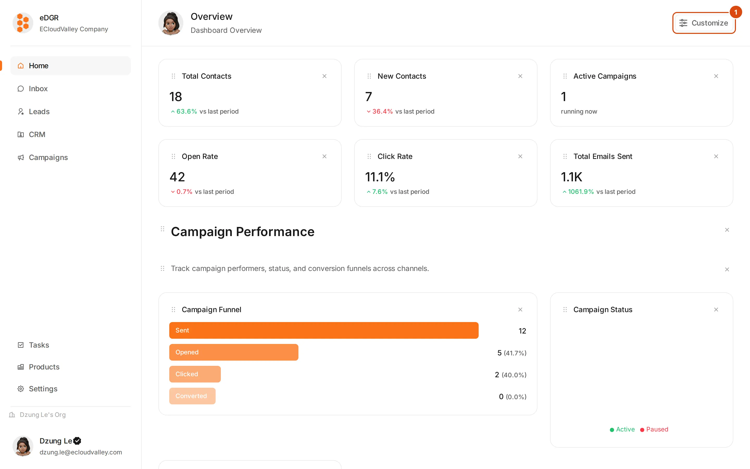
/home opens after sign-in. It is a grid of widgets you choose yourself: three columns on a desktop, two on a tablet, one on a phone.
Customize
Opens the drawer holding both the widget picker and the list of dashboards. Everything on this page is added from there.
Open Customize
Header → Customize → the drawer opens on the Widgets tab.
Find a widget
Widgets are grouped by category; the search box filters by name. Each row shows the widget’s name and one line about what it measures.
Add it at a size
Each row has three buttons: S takes one column, M two, L the full width. Click one and the widget lands at the bottom of the grid.
Reorder
Drag a widget by its card to move it. The grid reflows around it.
Remove
Use the widget card’s own menu.
Dashboards are saved in your browser, not on the server. A teammate opening the same org sees their own layout, and clearing site data resets yours to the default.
Several dashboards
Customize → Dashboards tab holds the list. From there you can create a dashboard, rename it, delete it, and mark one as the default that opens after sign-in. A new dashboard starts empty.
Overview
Campaigns
Contacts
Engagement
Inbox
Knowledge Base
Content
| Widget | Shows |
|---|
| Total Contacts | Every contact in the workspace |
| New Contacts | Contacts added during the period |
| Active Campaigns | Campaigns currently running |
| Total Emails Sent | Emails sent during the period |
| Open Rate | Average email open rate |
| Click Rate | Average click-through rate |
| Widget | Shows |
|---|
| Campaign Status | Campaigns split by status |
| Top Campaigns | Best campaigns by open rate |
| Campaign Types | Distribution of campaign types |
| Campaign Funnel | Sent → Opened → Clicked → Converted |
| Widget | Shows |
|---|
| Lead Status | Leads split by status |
| Contact Sources | Where contacts came from |
| Segment Sizes | Contact count per segment |
| Recent Contacts | Most recently added contacts |
| Unsubscribe Rate | Share of contacts who unsubscribed |
| Widget | Shows |
|---|
| Bounce Rate | Share of email that bounced |
| Best Send Times | Engagement by hour of day |
| Device Types | Opens split by device |
| Top Links | Most clicked links |
| Widget | Shows |
|---|
| Deliverability Rate | Share of mail that reached an inbox |
| Spam Complaints | Complaint count |
| Email Providers | Contacts by their email provider |
| Bounce Reasons | Bounces split by type |
| Widget | Shows |
|---|
| Total Documents | Documents in the knowledge base |
| AI Queries | Agent lookups during the period |
| Top Topics | Most queried topics |
| Document Usage | Most referenced documents |
Three layout blocks with no data behind them: Heading, Text Block and Divider. Use them to label sections of a long dashboard. Heading and Text Block are edited in place on the grid.